 Lesson Plan: Graphing and Interpreting Proportional Relationships
Lesson Objectives
This lesson can be completed in one 50-minute class period.
- Graph proportional relationships
- Interpret the meaning of points on graphs of proportional relationships
- Understand the concept of slope in the context of proportional relationships
- Compare different representations of proportional relationships (graphs, tables, equations)
Florida BEST Standards
- MA.8.AR.3.1: Determine if a linear relationship is also a proportional relationship.
- MA.8.AR.3.2: Given a table, graph or written description of a linear relationship, determine the slope.
- MA.8.AR.3.3: Given a real-world situation, determine if the relationship between two quantities is linear. Write an equation in slope-intercept form.
- MA.8.AR.1.3: Rewrite algebraic expressions with rational coefficients in different but equivalent forms.
- MA.8.F.1.1: Given a set of ordered pairs, a table, a graph or mapping diagram, determine whether the relationship is a function. Identify the domain and range of the relation.
Prerequisite Skills
- Plotting points on a coordinate plane
- Understanding of unit rate
Key Vocabulary
- Slope
- Origin
- Linear relationship
- Coordinate plane
Warm-up Activity (10 minutes)
Present students with the following data table showing hours worked and total pay for a part-time job:
| Hours Worked | Earnings ($) |
|---|---|
| 0 | 0 |
| 2 | 30 |
| 4 | 60 |
| 6 | 90 |
| 8 | 120 |
Ask students to:
- Plot these points on a coordinate plane
- Determine if they form a straight line through the origin
- Calculate the hourly wage (slope of the line)
Use this Desmos activity:
https://www.desmos.com/calculator/utzva5dltc
Teach (25 minutes)
Definitions
- Proportional Relationship: A relationship between two quantities where one quantity is a constant multiple of the other.
- Slope: The steepness of a line, calculated as the change in y divided by the change in x.
- Unit Rate: The rate per one unit of the independent variable.
- Origin: The point (0,0) on a coordinate plane.
- Linear Relationship: A relationship that forms a straight line when graphed.
- Coordinate Plane: A two-dimensional plane using x and y axes to determine the position of points.
Use this slide show to review these and other definitions:
Instruction
Demonstrate how to graph proportional relationships, explain how the unit rate relates to the slope of the graph, and show how to compare different proportional relationships using graphs.
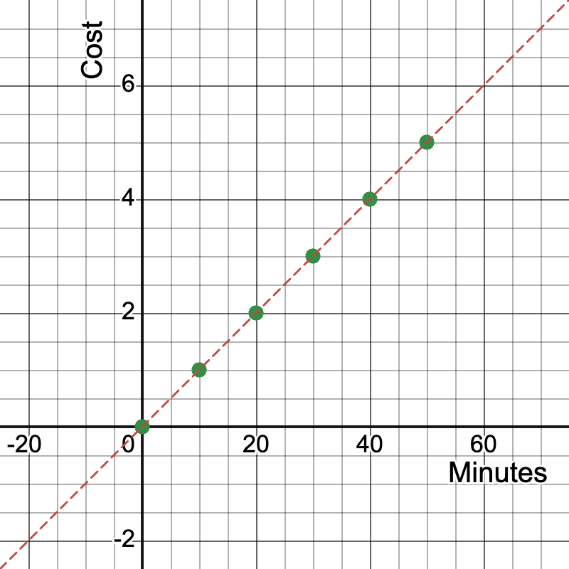
Example 1: Graphing a Cell Phone Plan
A cell phone plan charges $0.10 per minute of talk time.
- Create a table of values for minutes used and cost.
- Graph the relationship.
- Identify the unit rate and explain its meaning in context.
Solution:
| Minutes (x) | Cost (y) |
|---|---|
| 0 | $0 |
| 10 | $1 |
| 20 | $2 |
| 30 | $3 |
| 40 | $4 |
| 50 | $5 |
Graph: A straight line passing through these points and the origin.

Unit rate: $0.10 per minute, represented by the slope of the line.
Slope calculation: Slope = (y2 - y1) / (x2 - x1) = (5 - 0) / (50 - 0) = 5/50 = 0.10
Use this Desmos activity:
https://www.desmos.com/calculator/kamtpaelpc
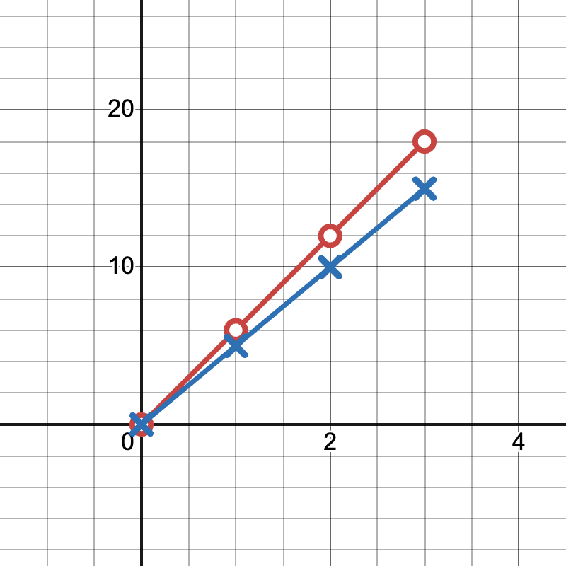
Example 2: Comparing Running Speeds
Runner A covers 6 miles in 1 hour.
Runner B covers 10 miles in 2 hours.
- Create a table of values for both runners.
- Graph both relationships on the same coordinate plane.
- Compare the speeds of the two runners.
Solution:
| Time (hours) | Runner A Distance (miles) | Runner B Distance (miles) |
|---|---|---|
| 0 | 0 | 0 |
| 1 | 6 | 5 |
| 2 | 12 | 10 |
| 3 | 18 | 15 |
Graph: Plot both sets of points on the same coordinate plane.

Runner A's line is y = 6x, Runner B's line is y = 5x
Runner A is faster as their line has a steeper slope (6 vs 5).
Use this Desmos activity:
https://www.desmos.com/calculator/owuxtaevo1
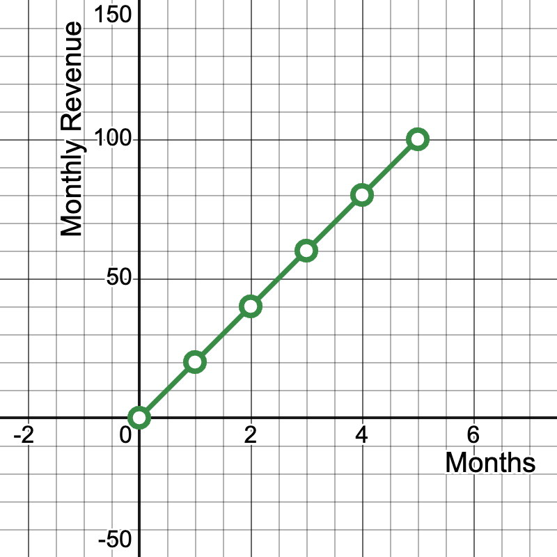
Example 3: Sales Growth in a Startup Business
A tech startup's monthly revenue growth is shown in the following data:
| Months since launch | Monthly Revenue ($1000s) |
|---|---|
| 0 | 0 |
| 1 | 20 |
| 2 | 40 |
| 3 | 60 |
| 4 | 80 |
| 5 | 100 |
- Graph this relationship on a coordinate plane.
- What does the point (3, 60) represent?
- What is the meaning of the slope in this context?
Solution:
Graph: A straight line passing through these points and the origin.

- The point (3, 60) represents that after 3 months since launch, the company's monthly revenue was $60,000.
- Slope calculation: Slope = (100 - 0) / (5 - 0) = 20
- The slope of 20 means the company's revenue is growing by $20,000 per month.
- This linear relationship indicates a consistent growth rate, which is a positive sign for the startup.
Use this Desmos activity:
https://www.desmos.com/calculator/pmft2bgx4q
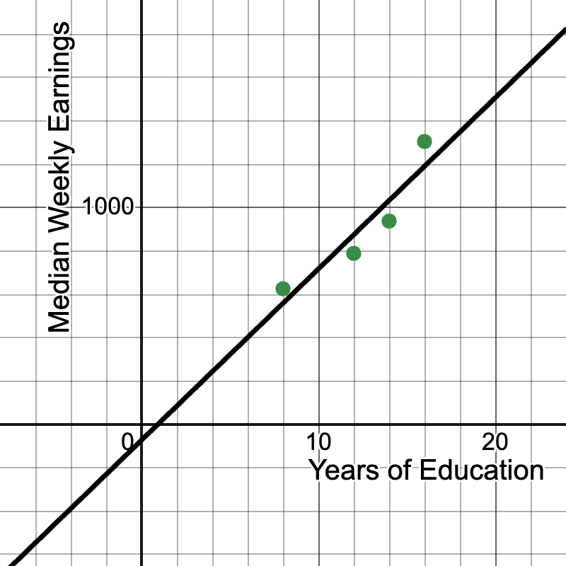
Example 4: Education and Income Relationship
Let's examine the relationship between years of education and median weekly earnings using real data from the U.S. Bureau of Labor Statistics (2020):
| Years of Education | Median Weekly Earnings ($) |
|---|---|
| 8 | 626 |
| 12 | 789 |
| 14 | 938 |
| 16 | 1305 |
- Graph this relationship on a coordinate plane.
- What does the point (16, 1305) represent?
- Is this a proportional relationship? Why or why not?
Solution:
Graph: Plot the points on a coordinate plane. The resulting line will not pass through the origin. (Note: The graph is a linear regression line.)

- The point (16, 1305) represents that individuals with 16 years of education (typically a bachelor's degree) had median weekly earnings of $1,305.
- This is not a proportional relationship because:
- The graph does not pass through the origin (0, 0).
- The rate of change (slope) is not constant between all points.
- The range of this graph would be for x ≥ 0, since it makes no sense that 0 years of education resulting in any earnings.
- However, there is a clear positive correlation between years of education and median weekly earnings.
- We can calculate the average rate of change: Slope = (1305 - 626) / (16 - 8) = 679 / 8 ≈ 84.88 This means that, on average, each additional year of education is associated with an increase of about $84.88 in median weekly earnings.
Use this Desmos activity, which includes a regression line:
https://www.desmos.com/calculator/q2gs51jf5f
Review (10 minutes)
Group activity: Students analyze and graph real-world data from arts, technology, and sports. Use this slide show to support the following three examples, which include data sets and lines of best fit. The slope as a unit rate can potentially be used to make predictions:
https://www.media4math.com/library/slideshow/applications-proportional-reasoning-linear-graphs
Example 1. Arts: Broadway Show Ticket Prices (2010-2019)
This data set shows the changing price of Broadway theater ticket prices.
Data from The Broadway League:
| Year | Average Ticket Price ($) |
|---|---|
| 2010 | 86.21 |
| 2013 | 98.42 |
| 2016 | 109.21 |
| 2019 | 123.87 |
Students graph this data and interpret the slope as the average yearly increase in ticket prices. Here is a Desmos activity you can use as a companion to this review activity. Note that it includes a line of best fit, which you can briefly explain to students:
https://www.desmos.com/calculator/mc1y6t4jwe
Example 2. Technology: Global Smartphone Sales (2016-2019)
This data set on Smartphone sales can be used to generate a line of best fit.
Data from Statista:
| Year | Smartphones Sold (millions) |
|---|---|
| 2016 | 1470 |
| 2017 | 1506 |
| 2018 | 1556 |
| 2019 | 1486 |
Students graph this data and discuss why this relationship might not be proportional. Use this Desmos activity, which includes a regression line. Discuss the advantages and disadvantages of this linear model:
https://www.desmos.com/calculator/t6nctgqhcp
Example 3. Sports: NBA Player Height vs. Points per Game (2020-2021 season)
This data set looks at the relationship between height and average points per game for NBA players.
Data from NBA statistics:
| Height (inches) | Avg Points per Game |
|---|---|
| 72 | 14.2 |
| 75 | 15.8 |
| 78 | 17.3 |
| 81 | 18.9 |
| 84 | 20.1 |
Students graph this data and interpret the slope as the average increase in points scored per inch of height. Here is a Desmos activity to use:
https://www.desmos.com/calculator/1hsko7f67q
Assess (5 minutes)
Administer this 10-question quiz.
Quiz
- Graph the proportional relationship y = 3x. What is the slope of this line?
- If a line passes through the points (0,0) and (4,12), what is the unit rate?
- Compare the steepness of y = 2x and y = 0.5x. Which has a greater rate of change?
- What does the point (1, 5) represent on a graph of a proportional relationship?
- Graph y = 4x and y = 2x on the same coordinate plane. How do they compare?
- If a car travels 240 miles in 4 hours at a constant speed, what is the slope?
- Does the graph of y = 3x + 2 represent a proportional relationship? Why or why not?
- On a graph of distance vs. time for a constant speed, what does the slope represent?
- If two people are running at different constant speeds, how would their distance-time graphs compare?
- What is the y-intercept of all proportional relationships when graphed?
Answer Key
- 3
- 3
- y = 2x has a greater rate of change
- For every 1 unit of x, y increases by 5 units
- y = 4x has a steeper slope
- Slope is 60 (miles per hour)
- No, because it doesn't pass through (0,0)
- Speed or velocity
- Different slopes, steeper slope indicates faster speed
- (0,0)
![]() Purchase the lesson plan bundle. Click here.
Purchase the lesson plan bundle. Click here.