 Lesson Plan: Graphing and Interpreting Proportional Relationships
Lesson Summary
In this lesson, students will explore how to represent proportional relationships using graphs and equations. They will analyze how proportional relationships appear on a coordinate plane, determine the constant of proportionality from graphs, and understand the connection between proportional relationships and linear equations.
Students will practice:
- Identifying proportional relationships in tables, equations, and graphs.
- Graphing proportional relationships and recognizing their key characteristics.
- Determining the constant of proportionality (\( k \)) from a graph.
- Understanding that proportional relationships are represented by linear equations of the form \( y = kx \).
- Interpreting the meaning of points on a proportional graph in real-world contexts.
This lesson strengthens students' ability to connect different mathematical representations of proportionality, helping them build a strong foundation for algebraic reasoning and real-world problem-solving.
Lesson Objectives
- Graph proportional relationships
- Interpret the unit rate as the slope of a graph
- Compare two different proportional relationships using graphs
- Explain the meaning of points on a proportional relationship graph
- Analyze real-world data to understand relationships in various contexts
Common Core Standards
- CCSS.MATH.CONTENT.7.RP.A.2.A
Decide whether two quantities are in a proportional relationship, e.g., by testing for equivalent ratios in a table or graphing on a coordinate plane and observing whether the graph is a straight line through the origin. - CCSS.MATH.CONTENT.7.RP.A.2.D
Explain what a point (x, y) on the graph of a proportional relationship means in terms of the situation, with special attention to the points (0, 0) and (1, r) where r is the unit rate. - CCSS.MATH.CONTENT.8.EE.B.5
Graph proportional relationships, interpreting the unit rate as the slope of the graph. Compare two different proportional relationships represented in different ways.
Prerequisite Skills
- Plotting points on a coordinate plane
- Understanding of unit rate
Key Vocabulary
- Proportional Relationship: A relationship between two quantities where their ratio remains constant.
- Multimedia Resource: https://www.media4math.com/library/43387/asset-preview
- Constant of Proportionality: The constant \( k \) in the equation \( y = kx \), representing the ratio between two proportional quantities.
- Multimedia Resource: https://www.media4math.com/library/43411/asset-preview
- Linear Relationship: A relationship between two variables that, when graphed, forms a straight line.
- Coordinate Plane: A two-dimensional plane defined by an x-axis (horizontal) and a y-axis (vertical).
- Origin: The point (0,0) on a coordinate plane where the x-axis and y-axis intersect.
- Slope: The rate of change between two points on a line; in a proportional relationship, the slope is the constant of proportionality.
- Equation of a Proportional Relationship: A linear equation of the form \( y = kx \) that represents a proportional relationship.
- Table of Values: A table that shows corresponding values for two variables in a relationship.
- Graph of a Proportional Relationship: A straight line that passes through the origin, representing a proportional relationship.
Multimedia Resources
- A collection of definitions on the topic of ratios, proportions, and percents: https://www.media4math.com/Definitions--RatiosProportionsPercents
- A student tutorial slide show on definitions on the topic of ratios, proportions, and percents: https://www.media4math.com/library/slideshow/student-tutorial-ratios-proportions-and-percents-definitions
Warm Up Activities
Choose from one or more activities.
Activity 1: Review of Linear Functions of the Form y = kx
Introduce students to the equation of a linear function and focus on proportional relationships where the equation is in the form \( y = kx \).
Example: A worker earns $15 per hour. Write an equation that represents this relationship.
Solution:
- Define variables: Let \( x \) represent the number of hours worked and \( y \) represent total earnings.
- The constant rate of change is 15, so the equation is: \[ y = 15x \]
Explain that the equation \( y = kx \) represents a proportional relationship where \( k \) is the constant rate of change.
Activity 2: Review of Constant of Proportionality
Review the concept of the constant of proportionality (\( k \)) and how it is determined in proportional relationships.
Example: A grocery store sells 5 pounds of apples for $10. Find the constant of proportionality.
Solution:
- Use the formula for the constant of proportionality: \[ k = \frac{\text{Output (y)}}{\text{Input (x)}} \]
- Substituting the given values: \[ k = \frac{10}{5} = 2 \]
Thus, the constant of proportionality is 2, meaning each pound of apples costs $2.
Encourage students to find the constant of proportionality in different real-world examples, such as unit pricing, speed, or currency exchange rates.
Activity 3: Review of Slope as Rate of Change
Present students with the following data table showing hours worked and total pay for a part-time job:
Hours Worked | Earnings ($) |
|---|---|
0 | 0 |
2 | 30 |
4 | 60 |
6 | 90 |
8 | 120 |
Ask students to:
- Plot these points on a coordinate plane
- Determine if they form a straight line through the origin
- Calculate the hourly wage (slope of the line)
Use this Desmos activity:
https://www.desmos.com/calculator/utzva5dltc
Teach
Key Concepts
1. Identifying Proportional Relationships
Proportional relationships have a constant ratio between two variables. This means that for any given input-output pair, the ratio remains the same. These relationships can be represented in multiple ways:
- Tables: A proportional table has equivalent ratios in all rows.
- Graphs: A proportional relationship is represented by a straight line that passes through the origin (0,0).
- Equations: The equation of a proportional relationship is always in the form \( y = kx \), where \( k \) is the constant of proportionality.
2. Graphing Proportional Relationships
When graphing a proportional relationship, follow these steps:
- Create a table of values showing input-output pairs.
- Plot each pair as a point on the coordinate plane.
- Check if the points form a straight line passing through the origin.
Example: A car travels 60 miles per hour. Graph this relationship.
- The equation is \( y = 60x \), where \( x \) represents hours and \( y \) represents miles.
- Create a table:
Hours (x) | Distance (y) |
|---|---|
1 | 60 |
2 | 120 |
3 | 180 |
When these points are plotted, they form a straight line passing through (0,0), confirming a proportional relationship.
3. Determining the Constant of Proportionality
The constant of proportionality (\( k \)) is the ratio of \( y \) to \( x \) in a proportional relationship.
Formula:
\[ k = \frac{y}{x} \]
Example: A store sells 4 apples for $3. What is the constant of proportionality?
Solution:
- Find \( k \): \[ k = \frac{3}{4} = 0.75 \]
Thus, the constant of proportionality is 0.75, meaning each apple costs $0.75.
4. Understanding the Equation of a Proportional Relationship
Every proportional relationship can be written in the form:
\[ y = kx \]
where:
- \( y \) is the dependent variable.
- \( x \) is the independent variable.
- \( k \) is the constant of proportionality.
Example: A taxi service charges $2 per mile. Write an equation for the cost of a ride.
Solution:
- \( k = 2 \), so the equation is: \[ y = 2x \]
5. Interpreting Graphs of Proportional Relationships
Each point on the graph represents an input-output pair in the proportional relationship.
Example: A water tank fills at a rate of 5 gallons per minute. The equation is \( y = 5x \). Interpret the point (4, 20).
Solution:
- The x-value represents minutes.
- The y-value represents gallons.
- The point (4, 20) means that after 4 minutes, the tank has 20 gallons of water.
Definitions
- Proportional Relationship: A relationship between two quantities where one quantity is a constant multiple of the other.
- Slope: The steepness of a line, calculated as the change in y divided by the change in x.
- Unit Rate: The rate per one unit of the independent variable.
- Origin: The point (0,0) on a coordinate plane.
- Linear Relationship: A relationship that forms a straight line when graphed.
- Coordinate Plane: A two-dimensional plane using x and y axes to determine the position of points.
Use this slide show to review these and other definitions:
Example 1: Graphing a Cell Phone Plan
A cell phone plan charges $0.10 per minute of talk time.
- Create a table of values for minutes used and cost.
- Graph the relationship.
- Identify the unit rate and explain its meaning in context.
Solution:
Minutes (x) | Cost (y) |
|---|---|
0 | $0 |
10 | $1 |
20 | $2 |
30 | $3 |
40 | $4 |
50 | $5 |
Graph: A straight line passing through these points and the origin.
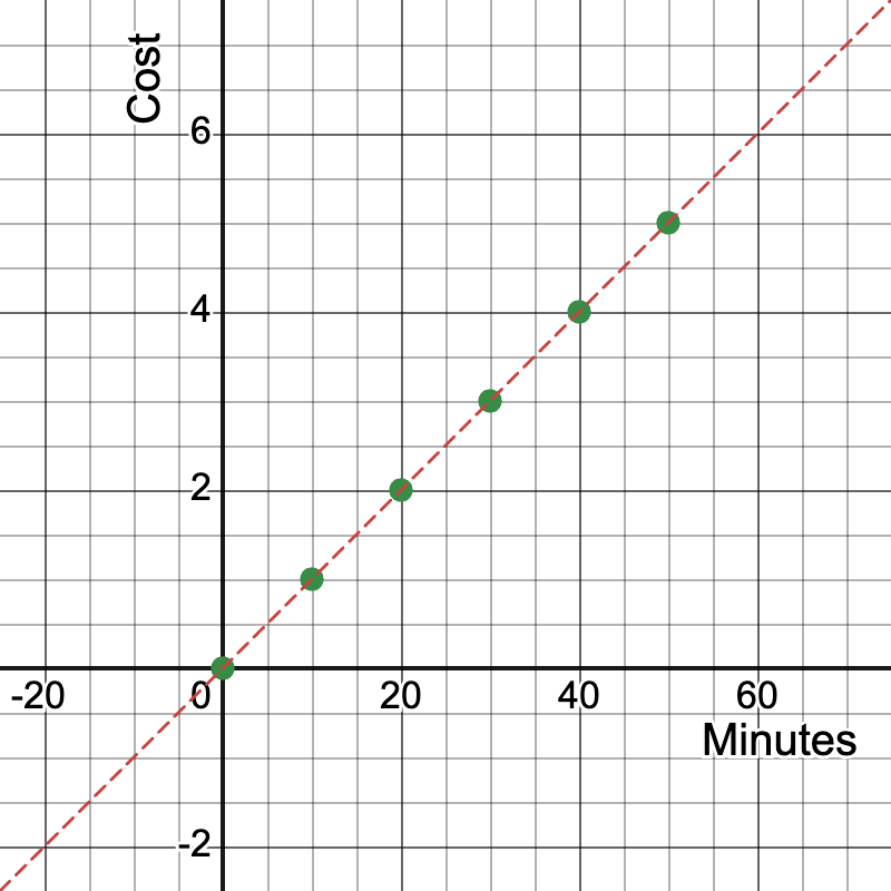
Unit rate: $0.10 per minute, represented by the slope of the line.
Slope calculation: Slope = (y2 - y1) / (x2 - x1) = (5 - 0) / (50 - 0) = 5/50 = 0.10
Use this Desmos activity:
https://www.desmos.com/calculator/kamtpaelpc
Example 2: Comparing Running Speeds
Runner A covers 6 miles in 1 hour.
Runner B covers 10 miles in 2 hours.
- Create a table of values for both runners.
- Graph both relationships on the same coordinate plane.
- Compare the speeds of the two runners.
Solution:
Time (hours) | Runner A Distance (miles) | Runner B Distance (miles) |
|---|---|---|
0 | 0 | 0 |
1 | 6 | 5 |
2 | 12 | 10 |
3 | 18 | 15 |
Graph: Plot both sets of points on the same coordinate plane.
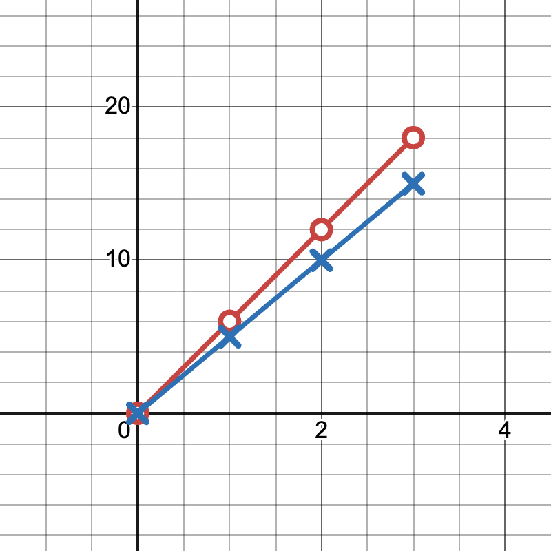
Runner A's line is y = 6x, Runner B's line is y = 5x
Runner A is faster as their line has a steeper slope (6 vs 5).
Use this Desmos activity:
https://www.desmos.com/calculator/owuxtaevo1
Example 3: Sales Growth in a Startup Business
A tech startup's monthly revenue growth is shown in the following data:
Months since launch | Monthly Revenue ($1000s) |
|---|---|
0 | 0 |
1 | 20 |
2 | 40 |
3 | 60 |
4 | 80 |
5 | 100 |
- Graph this relationship on a coordinate plane.
- What does the point (3, 60) represent?
- What is the meaning of the slope in this context?
Solution:
Graph: A straight line passing through these points and the origin.
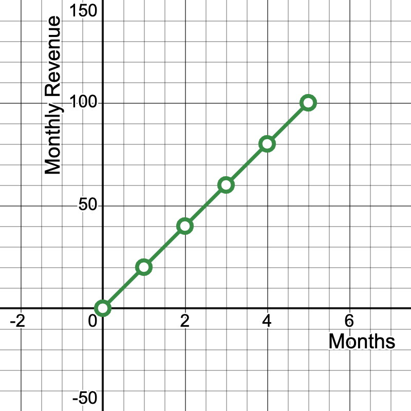
- The point (3, 60) represents that after 3 months since launch, the company's monthly revenue was $60,000.
- Slope calculation: Slope = (100 - 0) / (5 - 0) = 20
- The slope of 20 means the company's revenue is growing by $20,000 per month.
- This linear relationship indicates a consistent growth rate, which is a positive sign for the startup.
Use this Desmos activity:
https://www.desmos.com/calculator/pmft2bgx4q
Example 4: Education and Income Relationship
Let's examine the relationship between years of education and median weekly earnings using real data from the U.S. Bureau of Labor Statistics (2020):
Years of Education | Median Weekly Earnings ($) |
|---|---|
8 | 626 |
12 | 789 |
14 | 938 |
16 | 1305 |
- Graph this relationship on a coordinate plane.
- What does the point (16, 1305) represent?
- Is this a proportional relationship? Why or why not?
Solution:
Graph: Plot the points on a coordinate plane. The resulting line will not pass through the origin. (Note: The graph is a linear regression line.)
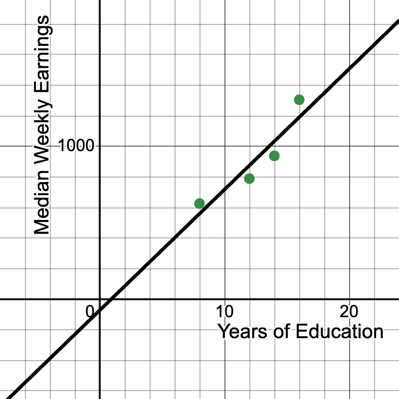
- The point (16, 1305) represents that individuals with 16 years of education (typically a bachelor's degree) had median weekly earnings of $1,305.
- This is not a proportional relationship because:
- The graph does not pass through the origin (0, 0).
- The rate of change (slope) is not constant between all points.
- The range of this graph would be for x ≥ 0, since it makes no sense that 0 years of education resulting in any earnings.
- However, there is a clear positive correlation between years of education and median weekly earnings.
- We can calculate the average rate of change: Slope = (1305 - 626) / (16 - 8) = 679 / 8 ≈ 84.88 This means that, on average, each additional year of education is associated with an increase of about $84.88 in median weekly earnings.
Use this Desmos activity, which includes a regression line:
https://www.desmos.com/calculator/q2gs51jf5f
Review
Lesson Summary
In this lesson, students explored how to graph and interpret proportional relationships using tables, equations, and coordinate planes. They learned that proportional relationships can be represented by the equation \( y = kx \), where \( k \) is the constant of proportionality. They also examined how proportional relationships appear on graphs as straight lines that pass through the origin.
Key takeaways from this lesson include:
- Identifying Proportional Relationships: A relationship is proportional if the ratio between two quantities remains constant and can be written as \( y = kx \).
- Graphing Proportional Relationships: Proportional relationships appear as straight lines that pass through the origin (0,0) on a coordinate plane.
- Determining the Constant of Proportionality: The constant \( k \) can be found using the formula: \[ k = \frac{y}{x} \]
- Interpreting Graphs: Each point on the graph represents a real-world proportional relationship between two variables.
- Using Tables to Identify Proportionality: A table of a proportional relationship will always show equivalent ratios.
By mastering these concepts, students are now prepared to analyze proportional relationships in real-world contexts and apply their understanding of proportional graphs in more advanced algebraic settings.
Group activity
Students analyze and graph real-world data from arts, technology, and sports. Use this slide show to support the following three examples, which include data sets and lines of best fit. The slope as a unit rate can potentially be used to make predictions:
https://www.media4math.com/library/slideshow/applications-proportional-reasoning-linear-graphs
Example 1. Arts: Broadway Show Ticket Prices (2010-2019)
This data set shows the changing price of Broadway theater ticket prices.
Data from The Broadway League:
Year | Average Ticket Price ($) |
|---|---|
2010 | 86.21 |
2013 | 98.42 |
2016 | 109.21 |
2019 | 123.87 |
Students graph this data and interpret the slope as the average yearly increase in ticket prices. Here is a Desmos activity you can use as a companion to this review activity. Note that it includes a line of best fit, which you can briefly explain to students:
https://www.desmos.com/calculator/mc1y6t4jwe
Example 2. Technology: Global Smartphone Sales (2016-2019)
This data set on Smartphone sales can be used to generate a line of best fit.
Data from Statista:
Year | Smartphones Sold (millions) |
|---|---|
2016 | 1470 |
2017 | 1506 |
2018 | 1556 |
2019 | 1486 |
Students graph this data and discuss why this relationship might not be proportional. Use this Desmos activity, which includes a regression line. Discuss the advantages and disadvantages of this linear model:
https://www.desmos.com/calculator/t6nctgqhcp
Example 3. Sports: NBA Player Height vs. Points per Game (2020-2021 season)
This data set looks at the relationship between height and average points per game for NBA players.
Data from NBA statistics:
Height (inches) | Avg Points per Game |
|---|---|
72 | 14.2 |
75 | 15.8 |
78 | 17.3 |
81 | 18.9 |
84 | 20.1 |
Students graph this data and interpret the slope as the average increase in points scored per inch of height. Here is a Desmos activity to use:
https://www.desmos.com/calculator/1hsko7f67q
Quiz
Answer the following questions.
- Graph the proportional relationship y = 3x. What is the slope of this line?
- If a line passes through the points (0,0) and (4,12), what is the unit rate?
- Compare the steepness of y = 2x and y = 0.5x. Which has a greater rate of change?
- What does the point (1, 5) represent on a graph of a proportional relationship?
- Graph y = 4x and y = 2x on the same coordinate plane. How do they compare?
- If a car travels 240 miles in 4 hours at a constant speed, what is the slope?
- Does the graph of y = 3x + 2 represent a proportional relationship? Why or why not?
- On a graph of distance vs. time for a constant speed, what does the slope represent?
- If two people are running at different constant speeds, how would their distance-time graphs compare?
- What is the y-intercept of all proportional relationships when graphed?
Answer Key
- 3
- 3
- y = 2x has a greater rate of change
- For every 1 unit of x, y increases by 5 units
- y = 4x has a steeper slope
- Slope is 60 (miles per hour)
- No, because it doesn't pass through (0,0)
- Speed or velocity
- Different slopes, steeper slope indicates faster speed
- (0,0)
![]() Purchase the lesson plan bundle. Click here.
Purchase the lesson plan bundle. Click here.